 From RIO:
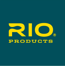
RIO Products, manufacturer of fly lines, leaders and tippet material, is pleased to show the world its new logo and tag line. After using the same logo since the company’s founding in 1990, RIO Products feels that it is time to show anglers its commitment to the advancement of its products through a strong logo and tag line.
RIO’s new logo features a subtle streamlined fish silhouette in the counter space of the letter “R” in RIO. This fish silhouette focuses the brand on the end goal of catching fish. The bold letterforms create a confident wordmark and visually establish RIO as a strong, reliable brand. RIO also chose a new color palette as a part of the branding exercise to be used for the logo and packaging on all products. This color palette is designed to help consumers easily distinguish RIO’s products while shopping. The visual concept is intended to be minimal and dynamic, taking cues from the graphic language associated with premium, high-end sports packaging.
RIO’s new tag line is, “RIO. Make The Connection”, which has multiple meanings – connection to fish, connection of tippet to leader to fly line and a “light bulb” moment. In crafting a new tag line, RIO wants to reaffirm that their products’ reliability, quality, and technology will help fulfill RIO’s brand promise; “RIO creates solutions to casting challenges, making fly-fishing easier, better and more enjoyable. From grip to cast, we are passionate about solving the problems that get between you, your rod, and the fish”.
“Creating a new logo for RIO has been an eye-opening process for the entire RIO Products team,” notes RIO Marketing Manager, Simon Gawesworth. “The new logo, tag line and color palette will give RIO a new identity, but anglers will be glad to find the same quality, durability and range of products they have come to appreciate over the last 22 years.”


